This page will give you some guidelines for creating content for our various social platforms based on the audiences we reach there and the available content formats.
On our social media channels, we reach several key audiences including:
- Concerned internet users who want to join our movement to create an internet that enriches their lives.
- Builders who are looking for resources to help them build more ethical consumer technology and AI.
- Policy influencers who rely on our research and data to help inform their policies.
The above are our primary audiences, but they aren’t our only social media audiences. We also reach a wide mix of other people like funders and journalists.
Sometimes, especially on TikTok, YouTube, and Instagram, content stands alone and tells a story by itself. For these channels, visual design is particularly important. Often on channels like Twitter and LinkedIn, social media drives people to our website to dive deeper into the work that we do.
How to reach out
- If you would like to request a marketing or communications campaign, please fill in this request form to the MarComms team.
- If you have questions about formatting or reviewing a graphic, reach out to the design team.
Quick Links
Posting Guidelines
Where you should post depends on what your content is and who you’re trying to reach. The MarComms Team is responsible for maintaining the Mozilla Foundation brand and content on our social channels. If you are running a campaign or are interested in posting content, please fill in this request form.
All stakeholder requested posts and stories should be reviewed and approved via the MarComms Team.
Social Channels
The following social media channels are shared amongst the Foundation and Corporation:
Primarily focused on concerned internet users:
Primarily focused on builders and policy influencers:
For hosting videos:
For links to Firefox social media see mozilla.org
Mozilla Branded Posts
Posts authored by Mozilla staff or Mozilla initiatives should be Foundation branded (see the Foundation Illustration template). This account is managed by the MarComms Team and the Corporation. Our content focuses on promoting the Mozilla mission and increasing awareness of issues affecting the internet today.
For example, a Foundation branded Mozilla post could include an Advocacy campaign or information produced by Mozilla around consumer privacy, such as the examples below:


Make sure to place the Mozilla logo on the bottom left corner of the image (or bottom right if it’s an OG image)
- Only place in the top left corner if the logo can't fit in the bottom left.
- Please keep the placement consistent and only move if specifically requested.
- Light and dark versions of the logo are available, choose one that shows up the clearest on the background. (Download here)
Variations of our colors can also be used for more themed posts like for MozFest or PNI.


2. Choose Graphics & Illustrations from Our Curated Styles
Stick to these selected styles of graphics and illustrations. When choosing a style, select one that connects well with the subject matter and if you’re making a multi-screen post, like an Instagram carousel, make sure to carry it through the entire post.


3. Include a Stylized Background
Backgrounds should contain a pattern, gradient, or noise/grain. Generally we like to use one of these or you can mix and match from something below. Make sure that text can still be easily readable on top of the background. These patterns can be found in this illustrator file. Generally we follow the formula of Background Color + Pattern and/or Texture (grain/noise)
Gradients Backgrounds

#6c77f6, #ff6871

#dfe1fd, #6c77f6

#ffe6e8, #ff4f5e

#5f5cee, #ffe6e8

#fffacc, #dfbbfd, #6c77f5, #ffa7ae, #a6fdff

#ffcfd2, #ff70d2, #ff6871, #dfbbfd

#ffd8f2, #c17cfc, #6c77f5, #75d8da

#1808f2, #ffe6e8
Patterns

Example Backgrounds

Tip: Adding grain or noise can help tie all the colors and elements together. (A common setting we like to use is Intensity: 18, Contrast: 58, Grain Type: Soft)
Other Tips for Instagram
- Minimum text size is 35pt (Photoshop), any smaller and it might not be readable on smaller devices.
- Don’t pack in text, make it as succinct as possible or break it up into a carousel.
- Always use a high contrast color in relation to the background.
- Use sentence casing to avoid looking as though you’re shouting.
- Give elements room to breathe on the image.
- If you need emojis or icons, use Twitter’s open-source emojis or icons linked on the Mozilla brand site or from feathericons.com.
- List of all common asset dimensions can be found here.

The Mozilla Foundation Blog
The blog should look and feel like one brand, and imagery is a big part of that.
We used various terminology for our different sized blog images. As well as the blog looking and feeling on brand, we also need to ensure images are responsive. This means that when our audience is looking at the blog on different devices with different screen sizes, the images still work and doesn’t get skewed or squashed in any odd way.
Homepage Feature Images
The homepage feature image is the image at the top of the Mozilla Foundation Homepage. The marketing team decide which blog pieces should be a homepage feature. If you think you have a blog piece that should be featured, please reach out to Audrey Hingle.
When choosing imagery for this you can NOT use the standard OG images and Blog header sizes for this image. This is a unique size and needs to be designed to ensure it works on different screen sizes.


Blog Post Headers
Blog headers should follow the rules above and can be purely visual, no copy or logo is required.
- Sizes: 1984px x 567px
- If limited on time or resources, you can always reuse graphics from our graphics library or the rapid response library.

OG Images
OG images are the thumbnails that show up when we share the blog links to social media. This should follow the same design as the blog header but with our logo. All blog posts should include an OG image.
- OG images should always be 1200x628px.
- Should include the full logo on the bottom right corner. This logo should relate to the part of Mozilla the article has come from, whether that be Mozilla Festival, Common Voice, or any other part of the company.

When you upload a new blog, you can upload an OG image by going to the ‘Promote’ tab and uploading it where it says ‘Share image’
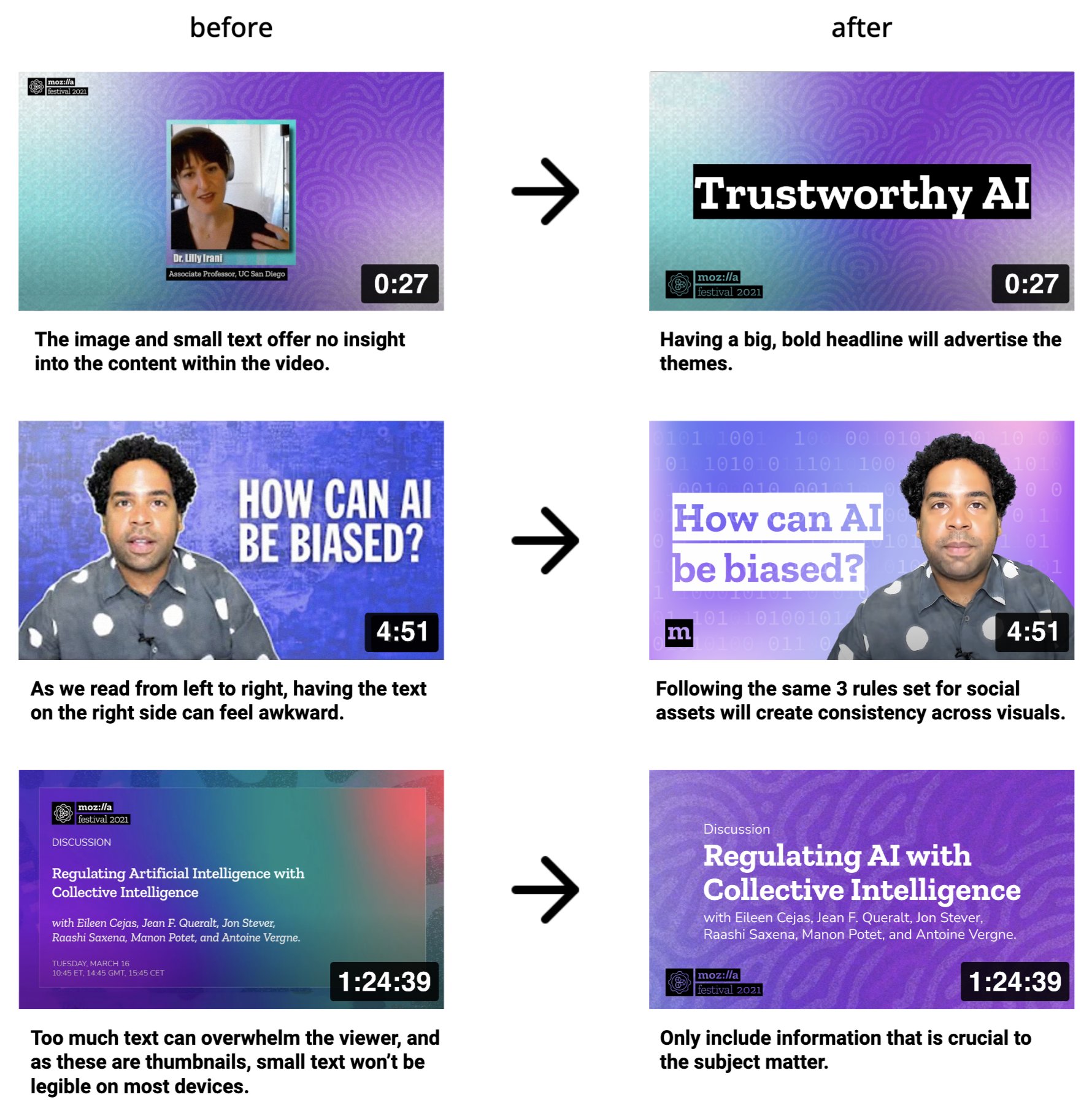
YouTube Thumbnails
These should follow all the rules listed above but also important to keep important titles and visuals out of the red zones as YouTube UI may cover those areas (see example).
- Make sure to keep compositions simple but eye-catching, adding attention-grabbing text within the thumbnail design either center-aligned or left-aligned
- Vary the text in the thumbnail, make this additive to the title of your video rather than duplicating the same copy
- Keep words in a contrasting color to help bring attention to the topic of the video
- When using a person in the thumb, use a photo making eye contact with a clear expression
- Remember that thumbnails are displayed small! Keep text legible at small sizes
- Keep logos in the lower left to avoid overlaps with YouTube features

Exporting Tips
- If your graphic is a photo or has a lot of texture, export as a JPG
- If your graphic is a vector, has simple shapes, or has transparency, export as a PNG
- For images that go on our website, they should be compressed before uploading to improve load times. We like to use tinypng.com.