The design process behind *Privacy Not Included mental health apps

By Nancy Tran | Oct. 26, 2022
On June 16, 2022, Calm, one of the most popular meditation and sleep apps available, made key changes to their privacy policy that clearly granted all users the same rights to access and delete data on their platform. Calm made this change shortly after being featured in the “Mental Health Apps” edition of Mozilla Foundation’s popular *Privacy Not Included buyers guide. There was no fanfare or press release for this change, but for users it meant having more control over their personal data.
This is just one example of how our *Privacy Not Included buyers guide has become a powerful tool for accountability - and as a designer, what I have to think about when creating visuals for Mozilla as a movement building organization. In this post, I want to share our team’s approach to tackling sensitive issues like mental health through design and making what could be a taboo conversation into something that’s open, accessible, and engaging.

What is *Privacy Not Included?
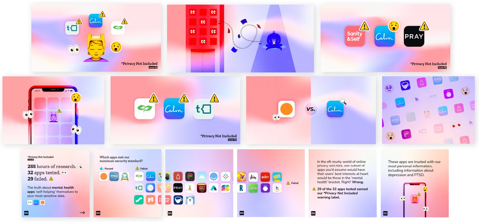
*Privacy Not Included (PNI) is our guide to buying internet connected apps and devices with privacy and security in mind. It’s also a way for us to raise awareness around tech products and the threats they can pose to people's personal data. Occasionally the guide will dive deep into a specific category and theme. In May of this year, the PNI team decided to review 32 mental health apps for Mental Health Awareness Month.
From the outset, the PNI team decided to focus on a parent and teen audience — people who can be most vulnerable to the consequences of insecure personal data on mental health apps. This meant creating graphics that were approachable and didn't need a lot of context to understand. Through our visual brand and tone, we’ve always aimed to convey urgency around critical issues without sensationalizing or fear mongering and always pointing to actionable paths that people can take. So for this launch, my goal (and challenge) was to create social media and marketing graphics that were friendly, digestible, while having clear warnings about the dangers of these apps.
Developing the designs
With this challenge in mind, I started by reviewing the look, feel, and personality of mental health apps currently on the market. I found that most mental health apps usually contained rounded corners, flat graphic styles, and bright and airy colors. They usually gave you a sense of calm and comfort and I wanted to bring that feeling into the graphics I made, while also referencing the PNI brand.

Based on my assessment, I decided to take more of the pastel colors from our brand colors and layer in PNI motifs, such as the creep-o-meter emojis and the *Privacy Not Included ding, to add a layer of personality to the graphics. The goal was to create a distinctive look for mental health apps that still fits under the broader PNI brand.

Creating simple but impactful visuals
Through many rounds of feedback with the PNI and design team, we landed on a design that we thought was simple but effective. The soft gradient and colors draw your eyes and give you a hint of the topic space. And displaying the apps as it would look on your phone screen with a notification signaled that this is an app you might want to investigate further. So hopefully, when people see this around the internet, they’ll be intrigued to find out more, or spark a conversation with themselves and their peers.
The result: One of our most successful launches!
As a designer at a non-profit, the goal for me wasn’t products sold but how many people we were drawing in and how many people acted on what they saw. Since the campaign launched in May, we saw 32,000+ visitors to the site and had our most successful Instagram post to date with over 3,500 impressions. We were mentioned in 87 news articles, both online and in print. We also encouraged at least eight of the mental health app companies we reviewed to make changes to their privacy and security practices.

With the success of this launch, we got a lot of requests to review more apps such as reproductive health apps. Seeing how impactful this launch was and having already done all the exploration work, I was able to remix this design style into something more appropriate for reproductive health in a shorter timeline.

Our success represented the work of many different teams on the Mozilla Foundation such as marketing, advocacy, and of course the PNI researchers Jen and Misha. I’m proud of the work of the broader team, and the role of design in uplifting and enhancing the message of our important research, and supporting our campaigners in their conversation with these apps.
Nancy Tran
UX/UI Designer @ the Mozilla Foundation


