Introducing the U.S. Election Twitter Network Graph Tool

By Emmi Bevensee and Max Aliapoulios | Oct. 26, 2020
This is a blog post co-authored by Emmi Bevensee, a Mozilla Fellow hosted at the Anti-Defamation League. Emmi is co-creator of the recently-launched Social Media Analysis Toolkit (SMAT).
Who does Trump most interact with on Twitter? What does sectarianism look like in political social media? Who has the most influence on our politicians online?
Today, the team behind SMAT (Social Media Analysis Toolkit) is launching a live, updating and interactive network graph of U.S. politicians and the accounts they interact with on Twitter. You can use it to analyze things like influence and connections between various political figures in the process of the U.S. 2020 election.
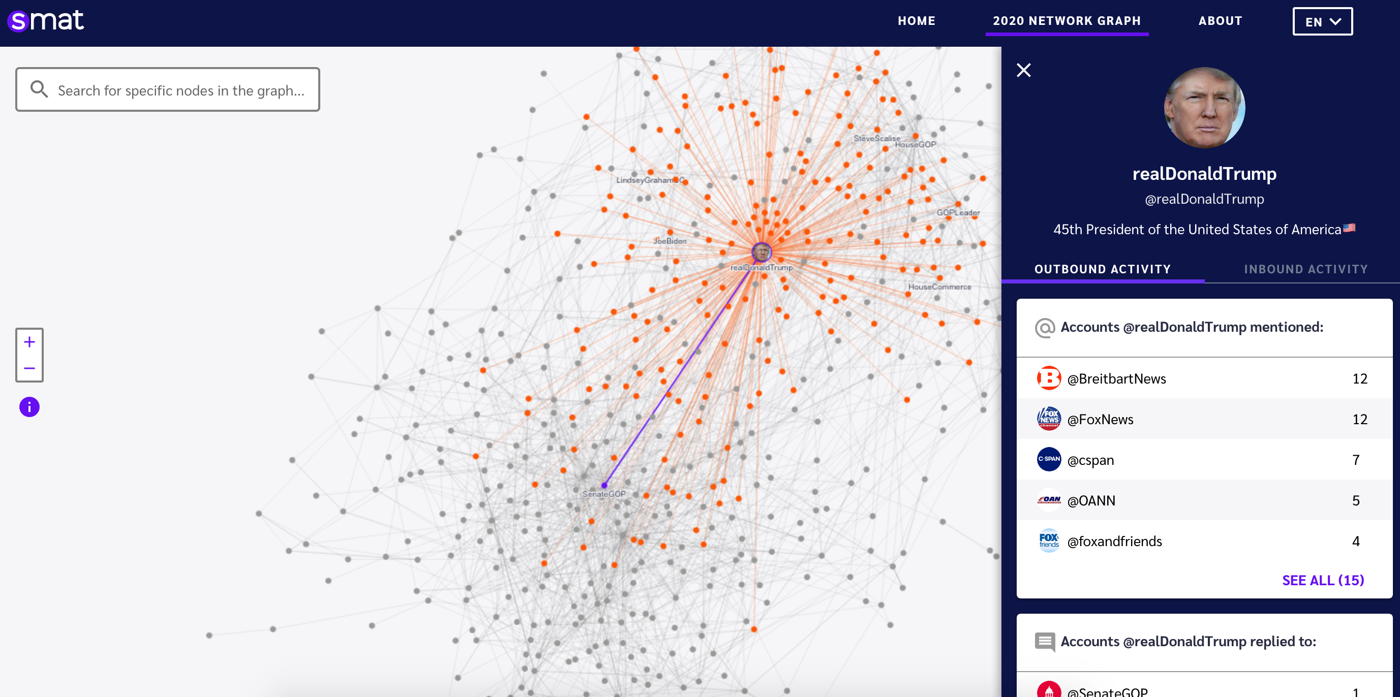
Network graphs are at the cutting edge intersections of several fields such as computer science, mathematics, and the social sciences. They provide a unique lens to make sense of interactions, especially for phenomena that move through interactions such as outbreaks. However, the “infodemic” we are experiencing now works in many ways like a pandemic, and so this technology becomes all the more useful. In this case, the SMAT 2020 Election network graph helps users analyze the interactions that define our online political landscape. Since a network graph is a bird's eye view of interactions, it can offer surprising insights. For example, in the screenshot above, we can see which accounts the president is most likely to mention or reply to.
From this view, it also becomes simple to do things like pivot through networks and look at relationships that would be harder to spot in just reading all of a user's tweets. With network graphs, it’s easier to ask questions such as “Who connects these two people?” and “Who is the most important person in this social network?” With the information provided by network graphs we can see more clearly who is most able to generate new connections and influence their followers.
This network graph has a search feature to find politicians by their username. The list of seed politicians accounts was taken from these CSPAN lists. The app has zoom features, loads fast, is free, and all of the front-end code is open-sourced (along with the rest of SMAT). When you click on a node, it highlights that user’s connections. Furthermore, if a particular user (or node) is interesting, the app allows you to share a direct link to that user and their connections.
In order to best make sense of a network graph, it is important to understand some basics about network science and as such this tool also offers a unique opportunity to learn about this growing field while performing investigations:
Nodes: These are the circles. A node is an entity in a graph. In this example each node represents a single Twitter account. We sourced the list of users from several CSPAN Twitter lists of politicians. This is generally referred to as a vertex in graph theory and a node in network science.
Edge: These are the lines. An edge is a connection between two nodes. These represent some form of connection between two nodes. We have two edge types represented in this graph, direct replies and mentions on Twitter.
Directed graph: A directed graph is where the edges represent some flow of information. So for example, a network graph showing contagion would be considered directed because contagion moves from one individual to another. Whereas a network graph that just shows contact tracing would be undirected because both people are connected equally. In the SMAT 2020 election graph, the lines represent the flow of information so it is considered directed. For example if @PoliticanA replies to @PoliticianB then there will be a directed edge from @PoliticianA to @PoliticanB. The same is true for mention edges.
Layout: The layout of this graph has to do with the way the nodes are distributed. For example tightly connected nodes tend to be closer together. In our graph here, the layout is determined by clustering similar entities together and forcing away less connected entities.
Outbound and Inbound Activity: Shows a list of users who the current selected user has interacted or was interacted with. In the outbound scenario, the list shows users who the selected user has mentioned or replied to. In the inbound scenario, the list shows users who have direct mentioned or replied to the selected user. All the detailed lists included users not in the seed lists from CSPAN.
By diving more deeply into the Inbound Activity tab we can see suspicious activity such as one of the top Biden hate repliers is this account who replies to him thousands of times. There’s also a small account seemingly pretending to be a deceased (Canadian) pro athlete also responding to Trump thousands of times with a repeated script.

This new election network graph tool is meant to be a complement to the existing open-source investigation tools provided by SMAT and outlined in a prior Mozilla blog post. Amid this infodemic, the future of democracy in the age of the internet depends on robust and easy to use tools to analyze and ultimately counter the spread of things like mis- and disinformation. Looking at social media networks helps to visualize the types of networks of influence that can have adverse effects on our elections. Transparency such as this is the key to breaking out of this cycle and building the types of systems that are worthy of trust.
More than ever, we need a movement to ensure the internet remains a force for good. Mozilla Fellows are web activists, open-source researchers and scientists, engineers, and technology policy experts who work on the front lines of that movement. Fellows develop new thinking on how to address emerging threats and challenges facing a healthy internet. Learn more at https://foundation.mozilla.org/fellowships/.